Content
- Abstract
- Assignment 01 – Ad Series
- Assignment 02 – Remake
- School Day 01 – Sharpening
- School Day 02 – Product
- School Day 03 – Carnival
- School Day 04 – Idealistic Campaign
- School Day 05 – Supper
- School Day 06 – Remake
- School Day 07 – Opening
- School Day 08 – Chocolate
- School Day 09 – NY Perspectives
- School Day 10 – Assessment
Abstract
This is a selection of the results generated during “Module 07 – Advertising & Product”.
Module Content:
Creating powerful advertising (photography) as well as a continuation
of product photography.
Module Teacher:
Ruben
Schumacher.
Assignment 01 – Ad Series
Description
Create a series (4–8) images for the advertisement of a product, service, idea, etc., using a central concept.
Plan
General outline of the ad series:
- Subject: Running shoes.
- Concept: Shoes that make you run better/more comfortable.
- Style: Clean, “fresh” colours.
- Ad ideas (also see sketches in the results section below):
- Running faster than your shadow — Image of runner with a lagging shadow.
- Like walking on clouds — Image of runner running on clouds.
- Protection against the elements — Image of runner in the rain, rain not hitting the runner.
- Like sitting in a comfy chair — Image of runner sitting in a comfy chair as well as running.
- Mountains become molehills — Image of runner stepping over mountain peaks.
The runner in the adds will be shot in the studio against a pure white background (black in case of ad #3). The background will be lit in setup similar to that use for creating high-key portraits. To ensure the background will end up as pure white (also to ease montage later on), the background will be (very slightly) over-exposed. The model will be lit using a single light source from above and to the side (to simulate the sun as source). A reflector shield will be used, if necessary, to fill in the shadow areas.
The images will basically be a montage of 2 images, one of the runner and one of the “background”.
- The shadow will either be a silhouette created from the original runner shot, or that of runner catching his breath. The runner and shadow will then be pasted onto a clear background (either pure white, or a very light grey/colour).
- Here the runner will be merged with an image of a cloudy sky taken on a nice and sunny day.
- The rain shot will be created by shooting water from e.g. a watering can in front of a black background. Flash will be used to make the drops visible. The leg of the runner will then be merged into this images, leaving an area around the shoe free of rain.
- Because there isn't a suitable chair available in the studio. and as it will be a dificult to take the comfy chair to the studio, the chair shot will be created at home. The idea of movement in the runner will be created in Photoshop using the motion blur filter.
- For the background I will use a shot of (probably snowy) mountains from my archive. The runner will be pasted on top.
Results
Mood Board and Sketches
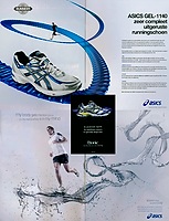 Ad Series – Mood Board Idea of the “mood” of the ads (see sketches for content). |
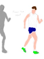 Ad Series Ad Sketch #1 |
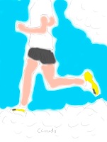 Ad Series Ad Sketch #2 |
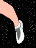 Ad Series Ad Sketch #3 |
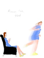 Ad Series Ad Sketch #4 |
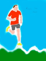 Ad Series Ad Sketch #5 |
Resulting Advertisements
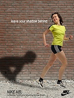 Nike Air – Ad #1 |
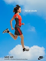 Nike Air – Ad #2 |
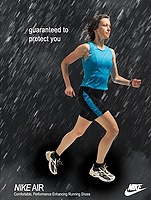 Nike Air – Ad #3 |
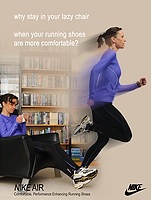 Nike Air – Ad #4 |
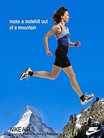 Nike Air – Ad #5 |
Assignment 02 – Remake
Description
To celebrate the move of the Fotovakschool to a new building, two classes have been asked to work on a large project: the remake (not a reconstruction!) of the painting “Supper at the House of Burgomaster Rockox” by Frans Franken II.
Plan
After a bit of discussion, it was decided we were going to recreate the front scene (people at the table), and the painting “Samson and Delilah” by Peter Paul Rubens as seen on top of the fireplace in the main painting.
- The Samson and Delilah painting will be recreated in a carnivalesque setting with Samson as a drunk on top of Delilah.
- The supper setting will be remade with people in black suit, the food will be replaced by all sorts of camera gear.
Results
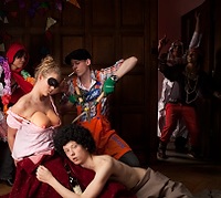 Remake of “Samson and Delilah” by Peter Paul Rubens |
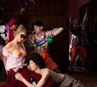 Remake of “Samson and Delilah” by Peter Paul Rubens |
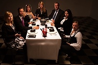 Remake of the supper scene of Frans Franken II's painting “Supper at the House of Burgomaster Rockox” Plain Version |
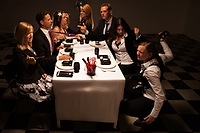 Remake of the supper scene of Frans Franken II's painting “Supper at the House of Burgomaster Rockox” Angry Version |
School Day 01 – Sharpening
Description
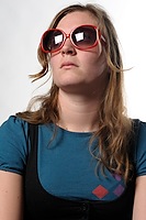
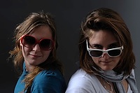
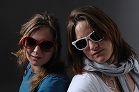
As getting sharp results seemed to be problematic to some, we started off with a short lesson in sharpening techniques. We were to take portrait shots under different conditions, also noting the effect of the different in-camera sharpening settings.
Plan
Take images, using both a low and a high iso setting, under the following circumstances:
- Brightly lit portait (almost no shadows, bright background)
- Dimly lit portait (lots of shadows, dark background)
Results
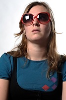 Mieke de Wit Low ISO |
 Mieke de Wit High ISO |
 Mieke de Wit and Dominique Brozek Low ISO |
 Mieke de Wit and Dominique Brozek High ISO |
School Day 02 – Product
Description
Take a product (jewelery) shot, taking care the setting conveys the pre-determined mood/feeling/message.
Plan
- Product: Pair off cufflinks.
- Setting: Designer cufflinks fastening the French cuffs of a white shirt.
- Mood: Classy, stylish, but not boring.
Results
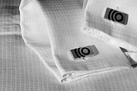 Cufflinks Straight shot. |
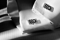 Cufflinks Added tension by using a shadow pattern. |
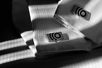 Cufflinks Added tension by using a shadow pattern. Together with the previous one, my favourite. |
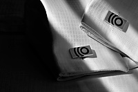 Cufflinks Different shadow pattern. Somehow this doesn't work as nicely as the other angle. |
School Day 03 – Carnival
Today we worked on our group project to remake the painting “Supper at the House of Burgomaster Rockox”. The part we worked on was the remaking of the painting “Samson and Delilah” by Peter Paul Rubens. The plan and results are part of Assignment 02 – Remake.School Day 04 – Idealistic Campaign
Description
Go outside and take a series of shots for an idealistic campaign (e.g., for a charity, political party, idealistic cause, etc.).
Plan
Inspired by the Dutch campaign “Nederland Schoon” as well as the devastating effect of all those (usually one time use only) store-provided plastic bags, I decided take shots for a campaign against the use of these bags. Instead of a negative approach (e.g., showing polution caused, etc.), I decided to a more positive angle: a campaign in favour of the better alternatives (e.g., paper bags and more durable, truly reusable, bags).
For this purpose I planned to shoot people with these types of bags, showing that these can be at least as easy to use, trendy, hip, etc. as their plastic one-time-use counterparts. As the focus should be on the bag, not the person, the face of the person will not be shown in the final shot.
Results
 Say No to Plastic – Billboard #1 |
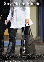 Say No to Plastic – Billboard #2 |
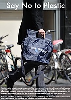 Say No to Plastic – Billboard #3 |
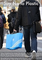 Say No to Plastic – Billboard #4 |
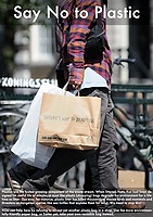 Say No to Plastic – Billboard #5 |
School Day 05 – Supper
Today we worked on our group project to remake the painting “Supper at the House of Burgomaster Rockox”. The part we worked on was remaking the supper scene. The plan and results are part of Assignment 02 – Remake.School Day 06 – Remake
Today we worked on the finishing touches and printing of Assignment 02 – Remake.School Day 07 – Opening
Little excercise in “association”, a technique to support the creative thought process.
Activities supporting the official opening of the new buidling.
School Day 08 – Chocolate
Description
Freely associate with the subject “Chocolate” and come up with an idea for an image usable for an advertisement (positive or negative).
Plan
Freely associating I came to the association of slavery with chocolate as the farming of cacao beans is still performed under poor conditions for the workers). This I used as starting point for further associating and finally narrowed the selection of associations down to the following list:
Cacao Beans, Cacao Powder, Chocolate Bar, Black, Blood, Red, Melted, Chains,
setting the main ingredients for the image below; a call to not buying the wrong kind of chocolate.
Results
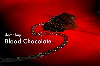 Blood Chocolate |
School Day 09 – NY Perspectives
Apart from performing the final touches on our assignment results, we also paid a visit to the “NY Perspectives – Amsterdam discovered by NY photographers” exhibition.School Day 10 – Assessment
My Own Learnings this Module
- Again: some more creativity (not nearly at the level I want to be though…).
- An assistant can be very useful on a shoot!
Input
The following material was used as the basis of the Assessment:
- Results of all the assignments.
- My own learnings.
Results
- Study Points: 6
- Advise: None
- Additional work required: None


