Content
- Abstract
- Assignment 01 – Magazine
- School Day 01 – Digital Workflow Basics
- School Day 02 – Digital Workflow Basics II
- School Day 03 – Recap
- School Day 04 – Selections
- School Day 05 – Colour Management
- School Day 06 – Review
- School Day 07 – Specials
- School Day 08 – Eyes on Media
- School Day 09 – Adobe InDesign
- School Day 10 – Assessment
Abstract
This is a selection of the results generated during “Module 02 – Digital Workflow”.
Module Content:
Digital Workflow (Colour management, Photoshop, etc.)
Module Teacher: Richard Hutjens
Assignment 01 – Magazine
Description
Create your own magazine. Think about the target audience, and make sure the design and typography match subject and audience. Use existing magazines as reference points.
Of the magazine you should create the cover (both front and back), as well as three pages. A few lines per article is enough; it is the form and layout that counts. Photographs should be used to support everything.
Plan
For the magazine I currently have the follwing basic ideas for the magazine and its content:
- Title: Quality Photo.
- Audience: Advanced photographers wanting to go for ultimate quality.
- Audience: People able and willing to spend money on quality gear and other things.
- Presentation: Glossy with high quality print.
- Reference points:
- Nikon Pro,
- Professional Photographer,
- Digital PhotoPro.
- Content:
- In depth background articles. Examples are:
- The use of Prophoto RGB (in a series of Colour Management),
- Expose to the Right (How to take the most advantage of your camera),
- Hyper focal distance,
- Tips for Pros,
- etc.
- New products. Examples are:
- New cameras and lenses,
- Other must have gadgets.
- Photography Tours with professional photographers to
enhance your skill. Examples:
- Squiver, PhotoCampus.
- Use of tools. Examples:
- Workflow (e.g., the use of tools like Bridge and PhotoMechanic),
- (Raw) editing (e.g., tools like Photoshop RAW, Nikon Capture NX, etc.)
- In depth background articles. Examples are:
- Adwork: Top range products of top brands. Examples:
- Monitors: EIZO (CG line).
- Cameras: Canon (5D and up), Nikon (D300 and up).
- Lenses: Canon (L-series), Nikon (only fixed max aperture).
- Printers: Epson (pro range), HP (B9180)
- Tablets: Wacom (Intuos line)
- etc.
Discussing above plan with Richard Hutjens (the teacher), I concluded that while my idea was Ok and would be enough to successfully finish the assignment, I should do something more challenging; the photo magazine would too close to my heart. I therefore have come up with the following revised plan:
- Working Title: Excellentia.
- About: Good wine, food, and everything that goes with it.
- Audience: People who enjoy a good glass of wine as well as good food.
- Audience: Willing to spend what is necessary to eat and drink well. Real gourmets.
- Presentation: High quality glossy.
- Reference Points/Existing Magazines:
- Allerhande (Albert Heijn's magazine, quite good actually)
- Appetito (Cooking magazine)
- Delicious (One of the better cooking magazines available in the Netherlands)
- La Cucina Italiana (Magazine predominantly about Italian cooking)
- Taste! (Gall&Gall's member magazine)
- Wining & Dining (Magazine for gourmets)
- Image:
- Quality
- Class and Style
- Clean, Sleek, and Simple design
- Enjoying the good things in life
- Good food and drink
- Adwork: All food and drink related, quality brands:
- Wine, Cognac, Whisky
- Cooking utensils, stoves, cutlery, dinner sets, glassware, etc.
- Restaurants
- Ingredients
- Content:
- Locations (markets, shops, etc.) to get quality ingredients
- How-tos and other background information
- Products and Product reviews
- Restaurant reviews
- Top recipes
- Fonts:
- Titles and headers: Should reflect the class and style of
the
magazine.
Font chosen: Copperplate. (note: font may not display correctly if you do not have it installed) - Main Text: A clean and simple font (matching the magazine
style) with high readability. Most likely a Serif font.
Font chosen: Garamond Premier Pro. (note: font may not display correctly if you do not have it installed)
- Titles and headers: Should reflect the class and style of
the
magazine.
- Colours:
- Main Colours: Black, White, and Grey.
- Supporting Colours: Probably some warmer tints (e.g., orangish, reddish, ochre).
- Layout: (see also comments below)
- Simple and clean.
- No “messy” layout where text and images are thrown in at random.
- Pages will have a uniform look (taking care not to become boring).
- Colour of titles will match the main colour the photo(s) on the page.
- Back cover page is an advertisement.
- Some page layouts:
- Single full-page photo on the left page (when the magazine lies open), text and (optional) smaller photos on the right page.
- One, two or three columns of text.
- Smaller images on the “outer” edges of the pages.
Looking through some of the existing magazines, there is a lot I do not like about them. For starters, regarding layout, most magazines appear rather busy and chaotic, using a hotchpotch of fonts. None of the magazines radiate Class and Style the way I would like it. This I definitely want to do differently so I'm going to opt for a much more clean and simple layout, sticking to that style for most, if not all, pages. I will also minimise the number of fonts used to avoid a chaotic look.
Luckily there were also things I did like, those things I will most likely use in my magazine as well. One thing I like about Taste!, for instance, is the use of colour: the colour of the headings matches the colours of the accompanying (main) photo(s), resulting in a non-disturbing, stylish layout. An idea from Appetito I liked was the layout they chose for some of their articles: one column of photos on the outer edge of the page, combined with two columns of text. Again a very “restful” layout.
For the photos I plan to take images in a few of the more upper market quality food and drink shops (e.g., our favourite wine and delicatessen shop, our favourite fish shop, and the specialised cooking shop annex cooking school). If that does not yield enough usable images, I can always try to take some images at the “Noordermarkt” (a food market, providing many of the top restaurants with their foodstuffs), and/or inside a top restaurant. Another idea is to photograph a dish at home for use as a recipe illustration for instance.
Articles I currently envision are on the three shops as mentioned, but this is can change based on the inspiration taking my images gives me…
To help me design the pages, I will first develop a “canvas” file containg samples of the different page layouts. Photoshop guides will help positioning the different content entities correctly on the page. To make sure I can still print the pages correctly, I have made the page canvas 20x28 cm instead of a full a4. For printing I will import all (flattened) images into a separate document, positioning the pages so that I leave some extra room for binding as well.
All Photos will go through the following basic work flow (in the Results section below, I will add the specifics for creating a particular page). Tools used are also indicated:
- RAW file preparation (all these optional steps performed
with Nikon
Capture NX 2)
- ProPhoto RGB colour profile
- White balance adjustments
- Exposure adjustments
- Shadow/Highlight recovery
- Basic retouching (e.g., removing dust spots and other minor things)
- Colour tweaks (Luminance, Chroma, and Hue).
- Capture sharpening (camera model determines settings)
- Straightening, Cropping
- Save processed full resolution RAW file to 16 bit TIFF. (Nikon Capture NX 2)
- Resize to exact size required. (Adobe Photoshop and/or Nikon Capture NX 2)
- Output sharpening of image for 300dpi inkjet
print. (Nikon Capture NX 2)
Note: I chose to perform output sharpening here instead of at the very end (i.e., just before printing) as I do not wish to risk sharpening other things (like text) as well. At this step, the photo is basically ready anyway so this should not pose any problems. - Insert image into magazine page. (Adobe Photoshop)
- Finish page. (Adobe Photoshop)
Results
Mood Board
Going through different magazines I tried to find images of things that would describe the type of magazine I envisioned.
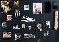 Mood Board |
Cover Page
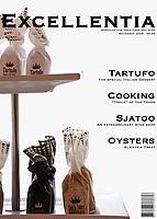
The cover page is buit up from a single image that already had lots of open space to allow for lettering. Specifics:
- The photo was resized to 28cm tall @300dpi, (making it less than 20cm wide though, but this is Ok as this will be filled-up with the background colour later).
- The image still had some unwanted things in the background that could not be removed during the retouch step in the RAW editing phase. The white of the background was also deemed a bit to bright. To correct this easily, I drew a path to select the background and bits to be removed. I then filled this path with an off-white (245,245,245) colour. The image was now ready.
- All that was now left was to add the magazine title and other lettering (main titles in black, subtitles in dark grey).
Feedback on my first version of the cover page:
- First letter of the title is not readable due to the metal pole in the background — Done ✓
 Cover Page |
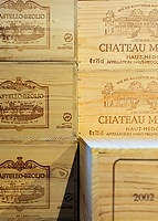
Page 24 – Photo Page on the left of the Sjatoo article
- In the raw processing phase, the front most wine crate was additionally blurred, improving the overall look.
- Single photo page, cropped to become exactly 20x28cm at 300dpi.
- Page number and magazine name added in black.
Feedback: No comments for improvements received.
 Page 24 |
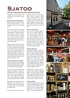
Page 25 – First page of the Sjatoo article, text with photos
- Additional image editing in the RAW processing phase:
- Top Photo – Replaced the blown-out sky with a more pleasing sky colour.
- Bottom Photo – Burning of the brightest parts.
- Photos resized to become 6.8x8.5, 6.8x4.5, 6.8x4.5, and 6.8x10.2cm at 300 DPI respectively (leaving approximately 1mm of whitespace between the individual photos).
- Article title in the same colour as the logo on the door of the shop (top photo).
- Page number and magazine name added in off-white to stand-out from the photo.
Feedback: No comments for improvements received.
 Page 25 |
Page 26 – Second and final page of the Sjatoo article, text with photos
- Additional image editing in the RAW processing phase:
- Top Photo – Burning of the brightest parts.
- Photos resized to become 4.8x4.7, 4.8x6.8, and 4.8x3.2cm at 300 DPI respectively.
- Article title in the same colour as the title on the first page of the article.
- Page number and magazine name added in black.
Feedback on my first version of this page:
- Don't let the images stick out of the columns (breach of style) — Done ✓
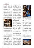 Page 26 |
Page 52 – Photo Page on the left of the Cooking “Tools” article
- Single photo page, cropped to become exactly 20x28cm at 300dpi.
- Page number and magazine name added in black.
Feedback: No comments for improvements received.
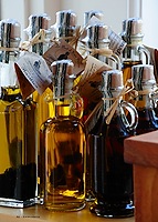 Page 52 |
Page 53 – First page of the Cooking “Tools” article, text with photos
- Photos resized to become 6.8x9.3, 6.8x4.5, 6.8x4.5, and 6.8x9.3cm at 300 DPI respectively (leaving approximately 1mm of whitespace between the individual photos).
- Article title in the same colour as the wood of the display on the top photo.
- Page number and magazine title added in off-white to stand-out from the photo.
Feedback: No comments for improvements received.
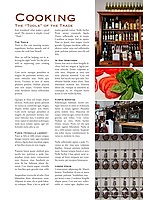 Page 53 |
Page 64 – Full article How-To — Raw Oysters (this is one of the articles in the magazine's Oyster special)
- Even though the white balance was measured with a grey card, the skin tones in the images were a bit unpleasant. In the RAW editing phase all four images therefore got a slight move towards yellow in the yellow/blue colour balance.
- All four photos resized to become 10.3x6.9cm at 300 DPI, leaving about 1mm whitespace between them.
- Article title in a colour taken from the shell of the oysters.
- Instead of a placeholder Lorem Ipsum text, I chose to write-out the full article text, taking care that everything fitted on the one page.
- Page number and magazine name added in off-white to stand-out from the photo.
Feedback on my first version of this page:
- Line-out article title with text (i.e., don't make it wider than the text column) — Done ✓
- Try to adjust the skin colours to make them more pleasing — Done ✓
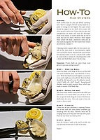 Page 64 |
Page 80 – Recipe Index Page
- Two images used to make one:
- The main image with the plate and spoon on a green cloth underground. To correct the colour of the soup and the peas in this image, the soup and the peas have been dodged in the RAW editing phase. Additionally, the peas have been made greener by increasing their magenta/green colour balance towards the greens.
- A separate image of a spoon was taken to be used as
replacement for the spoon in the main image. Note that I still could
not get the reflections to become the way I really wanted due to
restrictions posed by the angle in which I had to shoot the spoon.
Perhaps a lightbox would have helped, but alas I don't have
something like that.
Lesson learned: never try to take an image of a spoon the reflections are impossible to get looking any good…
- The main image was then further enhanced by removing most of the heavy reflections in the soup and from the peas. This was done mostly by using the clone tool at different opacity levels.
- The spoon was selected from the second image using a pen path.
- Replaced the spoon from the main image with the one from the second image. This was done by moving the new one over the existing one on a new layer. I only needed to apply some minor rotation and resizing to get a match; the new spoon was almost an exact fit to the original!
- As the reflections in the spoon were still not right, I used a little blurring to improve this a bit. It still isn't perfect, but at least way better than it was, and probably the best that is possible anyway…
- This merged photo page was then resized to become exactly 20x28cm at 300dpi.
- The green of the cloth background was replaced by creating a new layer filled with a target yellow (measured from the noodles on the facing page) on top of the image, using “colour” as the blending mode. A pen path was used to create a base layer mask containing everything but the plate and the spoon (those I wanted to show unaltered).
- As the white of the plate now still had some greenish reflections from the original cloth, the layer mask was edited with a soft brush, lightly painting over the greenish reflections.
- Title and list of recipes added in colour of the soup.
- Page number and magazine name added in black.
Feedback on my first version of this page:
- Green background does not fit rest of magazine-style, replace with something better, e.g., a matching yellow from the noodles on the facing page — Done ✓
- Use of centred text is not according to magazine style — Done ✓
- Text starts too high as well — Done ✓
- Soup is too dark, especially the peas. It all looks unappetizing now — Done ✓
- Replace the spoon with a better one (especially the reflections on the spoon top) — Done ✓
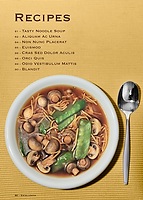 Page 80 |
Page 81 – Tasty Noodle Soup Recipe
- Photo resized to become 18x28cm at 300 DPI.
- Layer mask added to blend the excess (off-white) background of the noodle photo with the pure white of the main page.
- Article title in the same colour as the darker parts of the noodles.
- Recipe text.
- Page number and magazine name added in black.
Feedback: No comments for improvements received.
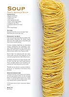 Page 81 |
Back Page
The back page is buit up from a single image and the Kopke logo. Specifics for the image:
- After cropping, the photo was resized to 20cm wide @300dpi, (making it less than 28cm tall though, but this is Ok as I needed space for advertorial text).
- As page backgound colour (and the base for the lettering), a matching black was measured from the photo. This to ensure a smooth blend with the page.
- All that was now left was to add the add lettering.
The Kopke logo, I got from the internet. However, as it originally was grey on a white background, I had to edit the logo before I could use it in this “ad”:
- Dramatically increased contrast using levels/curves (this turned the logo grey into black and made the white pure white).
- Performed some minor retouching on the logo.
- Deleted the white background to make it transparant.
- Inverted the image to make the logo white on a transparant background.
- Doubled the size.
- Positioned it onto the back page.
Feedback: No comments for improvements received.
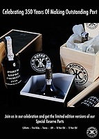 Back Page |
School Day 01 – Digital Workflow Basics
This was a quick run through the basics of digital workflow, colour and colour management as well as the basics of Bridge and Camera Raw.
Apart from creating a setup for the “Magazine” module assignment, no day assignments.
School Day 02 – Digital Workflow Basics II
Another day of digital workflow basics. This time all possible image adjustments from the Photoshop Image|Adjustments menu where discussed as well as the basics of layers and layer masks.
School Day 03 – Recap
Class review of the mood boards as developed for the “Magazine” assignment. The rest of the day was spent on a recap of Photoshop layers and layer mask as well as an introduction to text layers.
School Day 04 – Selections
Demonstration of the various methods of making selections in Photoshop. While I knew all of the different methods in theory, I had not really used them before. And only by actually using do you really understand the pros and cons of each of these tools. Practising with the pen tool to draw “paths” was really insightful!
School Day 05 – Colour Management
A whole day of Colour Management theory as well as a bit of practise. Nothing really new to me, I just may want to switch from calibrating my monitor at 6500K to the (ISO) standard of 5000K. Before this makes sense, however, I should also change the lighting conditions in my work room; now 5000 (or even 5500K) is now way to yellow compared to my prints.
School Day 06 – Review
Review of each other's progress on the Magazine assignment.
School Day 07 – Specials
Some special photographic techniques possible with the power of computing: HDR (High Dynamic Range), Panoramic, and 3D photography.
Especially taking 3D photos is quite funny and much less difficult than it seems! Here's a simple recipe:
- Take two images about 6cm apart (the distance between your eyes).
- Add them both as layers in a single document.
- If necessary, move the layers so that the area you want to have most “focus”, overlaps (no need to be precise).
- Remove all but the red RGB channel information from the “left” image layer.
- Remove the red RGB channel information from the “right” image layer.
- Set the blending mode of the top layer to “screen”.
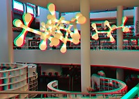 3D Illustration of a 3D photo. Produced from 2 shots, taken about 6cm apart. Best viewd with Red-Cyan 3D-glasses. |
 HDR Example of an HDR photo produced with PhotoShop CS3. Produced from 5 photos (-2EV to +2EV in 1EV steps) |
 Panorama Panorama made of 12 individual shots. The shots were taken in portratit orientation to increase the vertical resolution (not noticeable with this web-sized version of course). |
School Day 08 – Eyes On Media
Tour of the professional printing lab of Eyes on Media (formerly known as Capi-Lux). Very fitting for a module about digital workflow.
During the 2 hour tour we were shown the various print processes ranging from inkjet to chemical printing and the different materials and finishing methods that are available.
If you want a (large format) high quality print, Eyes on Media is your place! Just don't go there to get 10x15cm prints of your holiday snaps. Oh, they will print them fine, just more expensive than necessary…
School Day 09 – Adobe InDesign
A mini introduction to Adobe's InDesign, the desktop publishing application.
School Day 10 – Assessment
My Own Learnings this Module
- Practical use of Photoshop CS3 (previously I had only used Photoshop Elements).
- Drawing pen-paths. A very useful selection tool.
- Development of a mood board.
- Don't try to take photos of spoons…
Input
The following material was used as the basis of the Assessment:
- The results of the Magazine assignment.
- Final print, correctly colour managed.
- The original RAW files of the photos used in the the magazine.
- The (non-flattened) TIFF and PSD files used to create the pages.
- My own learnings.
Results
- Study Points: 6.
- Advise: None.
- Additional work required: None.


