Content
- Abstract
- Assignment 01 – Hip Shots
- Assignment 02 – Tabletop Photography
- Assignment 03 – What you don't See
- Assignment 04 – Self Assignment
- Assignment 05 – Book Cover
- School Day 01 – Introduction
- School Day 02 – More Details
- School Day 03 – Tabletop I
- School Day 04 – Tabletop II
- School Day 05 – Tabletop III
- School Day 06 – Photograms
- School Day 07 – Reviews and FOAM
- School Day 08 – Reviews
- School Day 09 – Homework
- School Day 10 – Assessment
Abstract
This is a selection of the results generated during “Module 09 – Image Development”.
Module Content: Creativity,
conceptual thinking, image analysis.
Module Teacher: Kees Rutten.
Assignment 01 – Hip Shots
Description
Create a series of casual images, taken “from the hip”.
Plan
Take the images in a well populated area in Amsterdam (e.g., the Central Station area). There should be plenty of opportunities for interesting shots there.
Results
This is a selection of the hip shots I somehow found worthwhile. Each shot contains some “action” or has some “suspense” as a means to make the shot interesting (at least to me).
No image manipulation has taken place; each shot is as it came out of the camera!
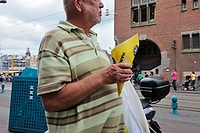 Walking with Fries |
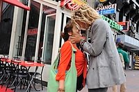 Kiss |
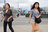 Around Me |
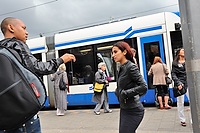 Couple interaction |
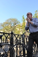 Sneeze |
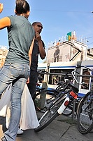 Smack? |
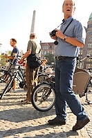 Picture taker |
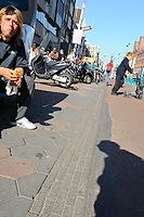 Startled |
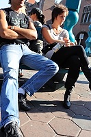 Hrmph |
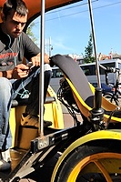 Bike-taxi driver |
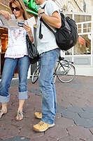 Map reading |
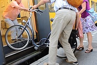 Getting a bike onboard |
Assignment 02 – Tabletop Photography
Description
Create and photograph a surreal “tabletop” landscape.
Plan
Using electronic components (e.g., resistors, capacitors, etc.), create a “landscape” of a man walking his dog.
Results
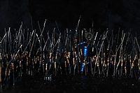 Man walking his dog, “resisted” – I |
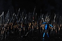 Man walking his dog, “resisted” – II |
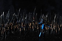 Man walking his dog, “resisted” – III |
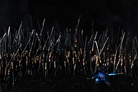 Man walking his dog, “resisted” – IV |
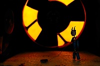 Man walking his dog, “blown” – I |
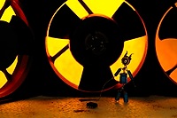 Man walking his dog, “blown” – II |
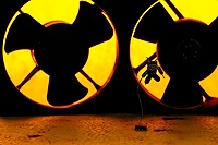 Man walking his dog, “blown” – III |
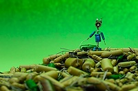 Man walking his dog, “decapacitored” – I |
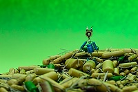 Man walking his dog, “decapacitored” – II |
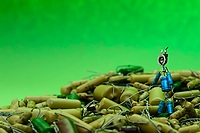 Man walking his dog, “decapacitored” – III |
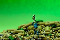 Man walking his dog, “decapacitored” – IV |
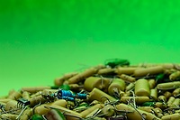 Man walking his dog, “decapacitored” – V |
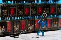 Man walking his dog, “relaid” – I |
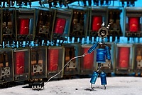 Man walking his dog, “relaid” – II |
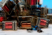 Man walking his dog, “relaid” – III |
Assignment 03 – What you don't See
Description
By leaving out things from an image, you can sometimes create even better images than those with the message in plain sight.
Plan
Try to get some interesting shots. If this does not yield the required results, set-up a situation that matches the assignment.
Results
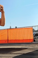 What? |
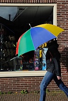 Umbrella |
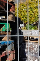 Covert |
Assignment 04 – Self Assignment
Description
Create your own assignment. Restriction: the assignment should be based on a concept.
Plan
Papendorp is a new business park in the centre of the Netherlands. Where ordinary business parks are seen mostly as “horizon pollution/blots on the landscape” Papendorp is set up to change this. The architectural standards for the (office) buildings have been set very high. To create (at least some) coherence between the different buildings and architecture, only “natural” building materials and colours are to be used.
Another aspect of the philosophy behind Papendorp is the visibility of the buildings from the two cornering highways, the A2 and the A12; travelling these roads should give you a constantly changing view on the park. The Prins Claus bridge, connecting the park to the city, is the landmark of the park.
Nature isn't forgotten either and the park is full of waterways, meadows and fields. A large area of allotment gardens is present as well, providing city residents a way to recreate and maintain a small garden. Cars are to be hidden from view as much as possible. Car parks should (mostly) be underground, with the buildings blending in with the landscape.
Many of the building plots have now been taken, so it is about time, the high standards are put to the test. Please judge yourself whether or not one has succeeded in making Papendorp not yet another blot on the landscape…
Note: It seems that at least some (learned) people think Papendorp is very well designed; the park design has won the architecture award RietveldPrijs 2009.
Results
Entry road
Entering the business park along the Papendorpseweg, the Capgemini campus immediately gives you a fine example of what to expect of the different design of the Papendorp business park.
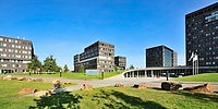 Capgemini Campus – Papendorpseweg The Capgemini campus is a very good example of how the architecture can be made to blend in with the environment. |
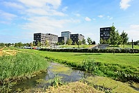 Capgemini Campus – Papendorpseweg While there is also a small car-park outside (the majority of the cars is parked underground), this is mostly hidden from view. Campus designed by de Architekten Cie. |
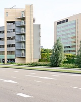 Atos Origin Campus – Papendorpseweg The Atos Origin site is another campus-like setup. In my opionion, done less attractively though. |
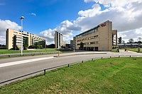 Atos Origin Campus – Papendorpseweg Campus designed by Niels Torn. |
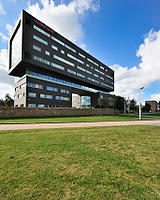 Ahrend – Papendorpseweg Situated next to the highway, and in fact slightly off the main road. |
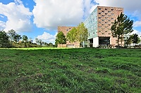 Prismant – Papendorpseweg Even though this building is situated next to the highway, there is still room for greenery to surround it. Building designed by David Walker together with Hooper Architects. |
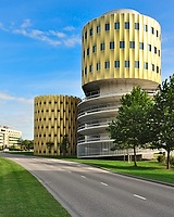 Multi-storey Car Park – Papendorpseweg This multi-storey car park (called “de Cope”) uses a very striking design. Building designed by JHK Architecten. |
De Taats
Where the rest of the business park is setup rather open with room for lots of “green”, the long-stretched area called “de Taats” is setup as dense city block with the buildings situated closely together.
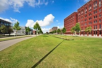 De Taats (right-hand side) Even though not all plots have been taken, you can already see the idea behind “De Taats:” a long stretched block of densely built, taller, offices with an awning covering all of the street side. |
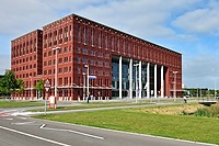 Domus Medica – Mercatorlaan Stately and imposing with its large columns at the entrance. Building designed by van den Oever, Zaaijer & Partners architecten. |
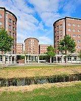 HP (formerly) – Orteliuslaan This large building was originally designed and built for Compaq, after the merger with HP, it was used as their Dutch head-office for a while. It is now vacated, awaiting new occupants. Building designed by O3 Architecten. |
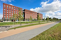 VVAA – Orteliuslaan The third building in “de Taats”, showing, yet again, the ideas behind this part of the park. |
Rest of the Business Park
The biggest part of the business park is designed “open”, with lots of space (and greenery) between the buildings.
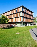 Mazars – Orteliuslaan Many of the smaller offices are built as a box with various designs and materials. Mazars' office is one of the many examples. |
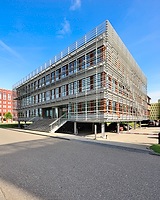 IPMMC – Janssoniuslaan Though still open-spaced, parts of the park see much less “green”. Designed by ZZDP architecten. |
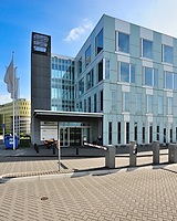 Generic Office – Janssoniuslaan |
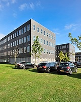 Deloitte – Janssoniuslaan As you can see, hiding cars from view hasn't always been successfull… Note: both the project leader of the park and the owner of the building are unhappy about this situation too, and changes are forthcoming! |
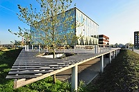 Generic Office – Ptolemaeuslaan |
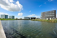 Integration This is the park at its best: water, greenery, and offices all integrated. |
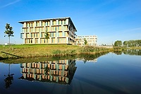 Generic Office “Maximus” – van Deventerlaan Building designed by Architectenbureau Hoogeveen b.v. |
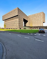 KPN – van Deventerlaan |
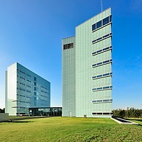 Synchroon – van Deventerlaan |
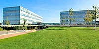 ISS – van Deventerlaan Building designed by ZZDP architecten. |
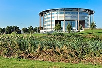 Mercedez-Benz – van Deventerlaan With its oval form, this building is completely at odds with the style of the rest of the buildings in the park, and therefore one of its eye-catchers! Building designed by van Tilburg Ibelings von Behr Architecten. |
Assignment 05 – Book Cover
Description
Develop a cover for the Holy Bible
Plan
Two things immediately sprang to mind when I started thinking about the Bible (and then especially the Old Testament):
- It's basically a war/battle story,
- There's lots of desert in it.
(a gross oversimplification of course…)
For me the book cover should bring those two together. So the idea is to take a sword (as a reference to the battle), and plant it in an area of sand. The sword's shadow on the sand will be made to look like a cross. Use of light and a dark and foreboding skye will add to the atmosphere. The sword will be a real sword, kindly lend to me by a friend for this occasion (thank you Michael).
To finish-off the book cover, the colour of the background will be the red as used for many old books, the title (simply “Holy Bible”) lettering will be gold in a simple and classical font (Garamond). To further the reference to something “old”, the cover photo will be made to look old and battered too.
Results
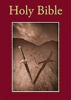 Holy Bible Primary version, worked out as planned. |
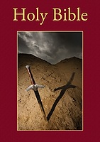 Holy Bible Alternative version, with the non-photoshoped image. I might actually like this one better… |
School Day 01 – Introduction
Introduction of the new module, first assignment (hip shots) as well as a visit to FOAM.
School Day 02 – More Details
Review of the first results of the “Hip Shots” assignment and a further description of the other assignments.
School Day 03 – Tabletop I
First session to work on the tabletop assignment. See Assignment 02 – Tabletop Photography for results.
School Day 04 – Tabletop II
Second session to work on the tabletop assignment. See Assignment 02 – Tabletop Photography for results.
School Day 05 – Tabletop III
Final session to work on the tabletop assignment. See Assignment 02 – Tabletop Photography for results.
School Day 06 – Photograms
Description
Using a mixture of materials, experiment creating photograms, developing them yourself.
Plan
Working together with Ronald Smits, create some fun photograms.
Results
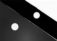 Photogram |
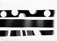 Photogram |
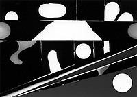 Photogram |
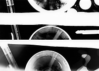 Photogram |
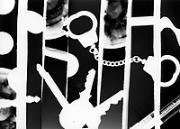 Photogram |
School Day 07 – Reviews and FOAM
Reviews of the results to date as well as a visit to FOAM. The latter specifically for the exhibition of Leonie Purchas (which was very impressive by the way!).
School Day 08 – Reviews
More reviewing of the work to date as well as some (needed) basics on light and form.
School Day 09 – Homework
A free day, available to finish work on the assignments (at home, in the studio, etc.).
School Day 10 – Assessment
My Own Learnings this Module
- More on concepts.
- Again, a bit more creativity.
- Some more Photoshop techniques.
Input
The following material was used as the basis of the Assessment:
- Results of all the assignments.
- My own learnings.
Results
- Study Points: 6
- Advise: None
- Additional work required: None


