Content
- Abstract
- Assignment 01 – Chain Letter
- Assignment 02 – Photo Diary
- Assignment 03 – Portrait of a Loved One
- Assignment 04 – Reconstruction
- Assignment 05 – My Street
- Assignment 06 – Presentation of a Well Known Photographer
- School Day 01 – Expectations for the first week
- School Day 01 – Henri Cartier-Bresson
- School Day 01 – Portrait of a Classmate
- School Day 02 – Who am I?
- School Day 03 – Composition
- School Day 04 – Where do you Look?
- School Day 05 – Portrait II
- School Day 06 – Thrilling Story
- School Day 07 – Hasselblad
- School Day 08 – Perspective
- School Day 09 – Exhibitions
- School Day 10 – Assessment
Abstract
This is a selection of the results generated during “Module 01 – Basics”.
Module Content: Photography basics (camera, apperture, shutter speed, etc.)
Module Teacher: Mohan Dehne
Assignment 01 – Chain Letter
Description
Based on a photo received either from the teacher or from another student, make a new image that rhymes on the received on. Send this image and send it to the next student. This in the end creates a chain of images that should have some sort of image rhyme.
Plan
This assignment was cancelled by the teacher.
Assignment 02 – Photo Diary
See Photo Diary.
Assignment 03 – Portrait of a Loved One
Description
Take a portrait photo of a loved one.
Plan
Take actually two images, two show the (at least) two sides of my wife:
- Look 1: Dreamy, Lovely, Sexy. To depict love.
- Look 2: Business, Strong.
Results
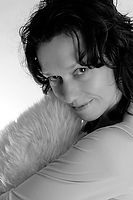 Lovingly - white |
 Lovingly - white |
 Lovingly - white |
 Lovingly - white |
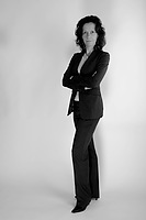 Business Woman - white |
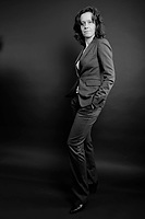 Business Woman - black |
 Business Womam - white |
Assignment 04 – Reconstruction
Description
Take an image of a photographer you like and try to reconstruct it, mimicking technique and form.
Plan
Idea: take one of the images of Bill Brandt and recreate it.
Results
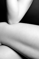 Human Forms I My reproduction of Bill Brandt's original image “Nude, East Sussex Coast”.. The image is not a 100% copy of the original, but uses its basic ideas, and certainly copies what I liked so much about it, namely showing human forms in an abstract way. |
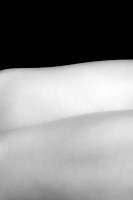 Human Forms II Based on the same principles, I constructed some more images, this time using my own ideas. |
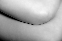 Human Forms III Another example. |
Assignment 05 – My Street
Description
Make a series of at least 6 photos depicting the street in which you live.
Plan
I would typecast my street as an average, modal, quiet, street with lots of green. Not too many children, average age 40+. To depict this, I am thinking of taking images of the following:
- Close up of an Opel logo; Opel indicating a Mr. average car (which indeed is seen a lot in our street).
- Overview shot with both sides of the street, especially the side with the water and the trees. This as an illustration of the greenness and spaciness of the street.
- Shot of the door with the curly family name lettering. Depicting overall friendliness and cosiness, “family”.
- Shot of a cat in front of a window. Again depicting overall friendliness and cosiness.
- People talking or walking their dog on the street.
- Spiders. There are usually lots of spiders around to catch flies, mosquitos (lots of water in the area), etc.
- …
Feedback from the initial showing of my draft results to the class as well as the teacher coupled with the different approach he wanted to see from all of us, made me have to alter the above plan though.
While I still need to describe the street, I will now need to focus more on a “theme”, whereas I previously showed a mixture of themes and subjects. I therefore decided to capture the middle-classness of our street. There are various examples of that and I will try to capture a few of them.
Results
Below six images form the representation of my street. In print these were combined into a small booklet printed on A4 paper in landscape orientation with each following page bigger than the previous. This resulted in a tiled booklet where underneath each page, the next one partially shows through. A title page completed everything.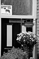 Welcome and Beware of the Dog Sign |
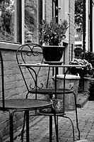 Table and Chairs |
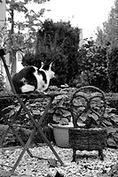 Cosy stone circle |
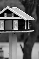 Bird house |
 Pumpkin on Stairs |
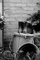 Plant Boots |
Assignment 06 – Presentation of a Well Known Photographer
Description
As a group exercise, make a short presentation of a well known photographer. In our case this is “Erwin Olaf”.
Results to be presented 10/09/2008.
Plan
Our group:
- Chrisine Heij: Current Assignments.
- Tom Sanner: Biography.
- Martika de Sanders: Style.
- Hayo Baan: Make the complete presentation out of the individual contributions.
Apart from the above personal tasks, everyone is to find about three images they like best and describe why they like them best. All results (draft) to be in before 30/08/2008. The presentation is scheduled for 10/09/2008.
Results
See presentation.School Day 01 – Expectations for the first week
Description
Describe your expectations of the week.
Plan
As expectations for the first week I have defined the following:
- Get to know each other.
- Layout of the study program.
- Basics of photography (though this probably will not teach me anything I don't already know).
Results
All my expectations have basically been fulfilled.
School Day 01 – Henri Cartier-Bresson
Description
Take images in “Henri Cartier-Bresson”-style.
Plan
Apart from the “moment” and the cleanliness (geometry, everything fits), what I also picked-up from Henri Cartier-Bresson's style, is his ability of getting the moment by means of people's expressions. As people are not normally the subject I take pictures off, my plan is to concentrate on people and their expressions. I will therefore be trying to capture them when they are focussed on an activity and capture their (facial) expression.
Results
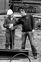 Foreman instructing worker Visible concentration of both the foreman and the worker. |
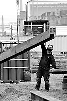 Moving the H-Beam into place The exertion of guiding the H-Beam is almost tangible. |
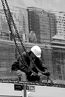 Fitting the chains Again, visible concentration on the job at hand. |
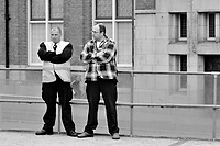 Gruff Two people discussing things they visibly do not approve off. |
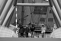 Getting over the bridge People getting over the bridge is what I wanted to capture. It didn't work out as I wanted though, mainly because there are distracting things like the person taking a picture on the ship deck and the woman behind the row of people. I also would have liked to have the people to either have looked all in a different direction, or all in the same direction, for instance. But that would have required more time, to wait for something like that to happen. |
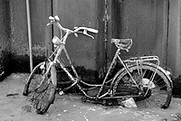 Bicycle parked in the canal Though not strictly within the scope of the assignment (and certainly not within my initial plan), I still could not resist taking this one. |
School Day 01 – Portrait of a Classmate
Description
Make a portrait of a classmate.
Plan
Make a simple head-and-shoulders portrait of a classmate.
Results
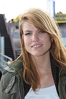 Christine Heij Simple shot for the face book. |
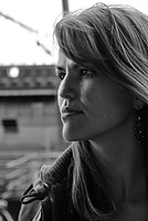 Christine Heij Though not part of the assignment, as it is a profile shot, I do like this one better. |
School Day 02 – Who am I?
Description
In 3 to 5 images, describe yourself. Taking into account the technical aspects like aperture and shutter speed.
Plan
Take images containing the following (all important aspects of me):- Computers and Technique.
- Film and Music.
- Photography.
- Travel, Sailing, Skiing.
- Tea.
- Cats.
- Order, Structure, Everything properly Categorised and Labeled.
- …
Results
Walking about, I did not succeed in getting images covering all of the above. Computers and Technique was easy and was actually shot in class. Film and Music also wasn't too hard; there is a second hand shop down the road with lots of CDs and DVDs. The racks of CDs and DVDs also show a bit of structure (though to be perfect, the titles should have been alphabetised…)
Cats and Tea didn't really work out (even though I drank two cups of tea with the Chinese Shopkeeper where I took the next shot). Order, structure and everything properly categorised and labeled is what I depict with the image of the wall of boxes filled with herbs and stuff. For travel and sailing I went into the nautic shop near the school building, I took some shots, but they didn't work out so I have not included them. Finally as an example of Photography, and especially the fact that theory-wise I know my way around pretty well (now for the creative side…), I took an image of a book on photography and image editing.
Instead of printing 5 separate photos which in themselves are not really nice to look at, I decided to make a combination of them and bring them into one image.
 Who Am I? For a description, see above. |
From the feedback from the class, I have succeeded in showing (part of) who I am pretty well.
School Day 03 – Composition
Description
Make photos showing the different compositions, e.g., symmetry, diagonals, stable/unstable, powerful, etc.Plan
Straightforward: Look for examples of the different compositions and take a photo of them.
Results
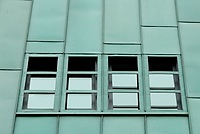 Symmetry An example of symmetry. |
 Diagonals An example of diagonals. |
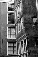 Falling over An example of an “unstable” composition. |
School Day 04 – Where do you Look?
Description
In a way a continuation of yesterday's day-assignment, this time we are to shoot using different techniques to get the viewer's focus on a certain aspect op the image. Examples of techniques are: Depth of Field, Lines, Movement, Viewpoint, Colour, etc.
Plan
No real plan, just try to find some examples of the different techniques.
Results
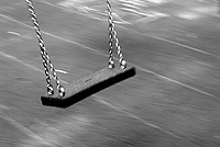 Swing Maybe not the best example, but here I strived to use motion blur (of the background) to get the viewer's focus on the swing. |
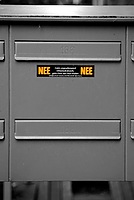 Letterbox No No Here I tried to use colour to get the attention on the letters. This I further exaggerate by turning the rest of the image Black & White. |
School Day 05 – Portrait II
Description
Take portrait shots of a class mate using “existing light” causing different lighting situations.
Plan
Look for different lighting conditions and make use of them.
Results
School Day 06 – Thrilling Story
Description
Take at most 24 images, select 6 of them and use them to tell a thrilling story.
Plan
Initially I had no idea what to do, but luckily this assignment was a group assignment. Discussing between the three of us, I soon developped the idea of making a series of the shoes of one of us running away, using motion blur (low shutter speeds) to accentuate the speed of things.
Results
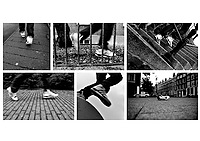 Thrilling Story Image tells the story of someone running away (from who/what is unclear). The lone shoe in the last frame leaves the viewer in suspense as to what happened to him. |
School Day 07 – Hasselblad
Description
Practice light metering and medium format shooting with the Hasselblad.
Plan
In small groups of 3–4 people, take shots under different lighting conditions.
Results
Judging the result of the developed film (colour positive!), we were successful in measuring the light and setting up the camera correctly. Here are two scanned results.
 David Reisig Scan of an image taken with a Hasselblad. |
 David Reisig Scan of an image taken with a Hasselblad. |
School Day 08 – Perspective
Description
Describe the “bird” perspective and its uses, also give examples of known photographers and take one illustrative example yourself.
Plan
Browse internet for definition as well as examples. The take image of class mate from a higher standpoint, making him look subservient.
Results
See Vogelperspectief (Dutch text).
School Day 09 – Exhibitions
Description
Day 9 of module 01 is a so called “Project Day” where you are “free” to do what you want to do.
Plan
This time we decided (as a group) to visit two exhibitions held at van Zoetendaal and Foam.
Results
(Please see the listed websites for more details and background)Van Zoetendaal
Although the website of van Zoetendaal states that the location is open daily from 11–18, you can actually only visit by appointment. We were lucky though: when we rang the bell the owner opened the door and let us in, he was even kind enough to tell us about the art (because that's what it is) he exhibits and how he works. Quite an interesting talk!
Van Zoetendaal always shows the work of others (basically of a group of about 15 photographers, all hand-picked by the owner himself, and many from the Rietveld Academy). By combining the work of different artists, and the way of placing the individual works, van Zoetendaal tries to “make” them, in that sense he himself is also an artist. Examples we saw were from Marjaana Kella, Paul Kooiker, Holger Niehaus, Johannes Schwartz, Harold Strak, and Wijnolt Visser (amongst others). With an example of Weegee (Arthur Fellig), we were shown what impact photography has (had?) on people, and especially how their behaviour is (was) adjusted. Famous in this respect is the photograph of a rescue attempt of a man who just drowned; the wife of the dying man is smiling into the lens!
Quote: “Art is the desire to want to understand”.
A very true statement, very much proven by the forms of art van Zoetendaal exhibits; without this desire, the works shown would have been nothing more than (sometimes very badly taken) pictures…
Foam
At the “FOAM_Fotografiemuseum Amsterdam” photos of Malick Sibidé (Chemises) and Pieter Hugo (The Hyena & Other Men) were exhibited. There was also an exhibition of Audrey Corregan (Obviously), but as I already spent all my time with Malick and Pieter, I didn't have time to view her photos as well.
Malick Sibidé’s photos taken in the 60's and 70's give a very good image of the time in the African country Mali (where he was born). Two types of pictures were shown at the exhibition: contact prints of “candids”, shot at various parties (Malick would visit up to five parties a night!), and various studio portraits. Of the “candids” (some where clearly posed), it was very interesting to learn that people really loved being photographed; as soon as the film was developed and the contact sheets printed they would rush to show themselves off to their friends (“look, that's me dancing with so and so”). Portraits were (are?) clearly seen as a way of showing yourself (your face and your possessions) to the world, important enough at least to practice in front of a mirror for! Having had a background in drawing further enabled Malick to have people pose in such a way that they still look alive (and not like a mummy).
Of Pieter Hugo, photos of street artists known as the Hyena Men were shown. Where Malick's images were mostly very small (contact sheet) prints, Pieter's images were shown in massively huge format. The format only amplified the power and impressiveness of the photos and their subject. Colour in the images is very subdued and basically only comes from the subject, again making your eyes focus on the important bit: the man and his (relation with the) animal. Very impressive!
All in all a very interesting exhibition, pitty I didn't have time to see the images of Audrey Corregan as well. Well, perhaps another day…
School Day 10 – Assessment
My Own Learnings this Module
- The work of some well known photographers, I didn't know of before.
- How you present your work is important (yes, this is an open door, but still very useful).
- Working with a Hasselblad (hadn't done that yet).
- Work off an assignment (so far I basically only shot for myself).
- Improve work after receiving feedback.
Input
The following material was used as the basis of the Assessment:
- My complete study portfolio (i.e., this website), including all the results of the module assignments as well as the day assignments.
- The printed version of the “My Street” assignment.
- The printed version of my own photographic portfolio (i.e., the one I would show to customers).
- My own learnings.
Results
- Study Points: 6 (maximum)
- Advise: Make a narrower selection of the work used for the photographic portfolio; only include those images that reflect your style.
Personal note: This is going to be a tough one for me as I don't yet fully know what my own style is… - Additional work required: None


